Have I become a lazy texter?
Data Analysis
2023
Personal
Dyl
—
May 15, 2023

Getting Called Out
Gab:
You used way more emojis when I first met you
Dyl:
I think it was a mating ritual haha
I recently got called out by my girlfriend for apparently sending her less emojis than I did when we first started dating..
I didn't like the implication that I had become a lazy texter over time; it is plausible though, as it's very likely that I was mirroring a higher level of emoji usage as a mating ritual. Naturally, I wanted to clear my name, so I downloaded our WhatsApp chat history and opened up a Jupyter notebook.
This post includes code snippets, and the full notebook code can also be found here.
Data Preparation
Firstly, I had to export the message history from our WhatsApp chat. Instructions for doing so can be found here. The exported text file will contain a line for each message of your chat history. e.g.
[18/5/2022, 6:05:12 pm] Dyl: I might need to get bus
[18/5/2022, 6:07:25 pm] Gab: Okay
Then in a Jupyter notebook, it was simply a case of reading this text file line by line
# Use readlines() to read the raw WhatsApp messages into a list of strings
file1 = open('gab_chat.txt', 'r', encoding = 'utf-8')
Lines = file1.readlines()
raw_lines = [line for line in Lines]
After inspecting the messages, I noticed that there were some gifs/images, forwarded messages and other system messages from WhatsApp that needed to be removed. Replies to gifs/images and reactions to messages will also be excluded
# This function is applied to the raw input lines to drop unwanted and/or system messages
def filter_raw_lines(raw_lines):
    lines_to_keep = []
    # First line is a system message from WhatsApp, drop it with "[1:]" splice
    for line in raw_lines[1:]:
        # Remove system messages, gifs/images and forwarded messages with "str.startswith(line, '[')"
        if (str.startswith(line, '[') and "Missed video call" not in line and "Missed voice call" not in line and "GIF omitted" not in line and "image omitted" not in line):
            lines_to_keep.append(line)

    return lines_to_keep

filtered_lines = filter_raw_lines(raw_lines)
With unwanted messages filtered out, I then proceeded to begin parsing the lines, e.g. to extract metadata
# This function parses the message content and metadata out into separate components
def parse_line_contents(line):
    split_line = line.split('] ', 1)
    date_str = split_line[0][1:].split(',')[0]
    # Note: dropping hour/minute/sec information from this point on
    date = datetime.datetime.strptime(date_str, '%d/%m/%Y')

    author = split_line[1].split(': ', 1)[0]
    message = split_line[1].split(': ', 1)[1].strip()

    return [date, author, message]

parsed_lines = [parse_line_contents(line) for line in filtered_lines]
At this point the data was still a list of lists, so I converted it to a polars dataframe. I actually tried to use pandas at first, but I didn't have the attention span to figure out aggregations in pandas and the polars interface was much easier to pick up. Note: I also filtered the dataframe to contain only the first 12 complete months of our chat history, which which was December '21 to November '22
messages = pl.DataFrame(data = parsed_lines, schema = {'datetime': 'datetime', 'author': 'str', 'message': 'str'})
messages = messages.with_columns(pl.col("datetime").cast(pl.Date).alias("date"))
# Filter the messages dataframe to only have the first full 12 months of data (Dec 2021 to Nov 2022)
filtered_messages = messages.filter(
pl.col("date").is_between(
datetime.datetime.strptime('2021-12-01', '%Y-%m-%d'),
datetime.datetime.strptime('2022-11-30', '%Y-%m-%d'))
)
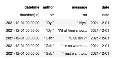
filtered_messages.head(5)
Finally, I extracted a bunch of information/metadata from the messages out into new columns on the dataframe. I'm using the emoji package to extract the emoji information out of the messages
prepped = filtered_messages.with_columns(
pl.col('message').apply(lambda msg: emoji.emoji_count(msg)).alias('emoji_count'),
pl.col('message').apply(lambda msg: len(re.findall(r'\w+', msg))).alias('word_count'),
pl.col('message').apply(lambda msg: [match['emoji'] for match in emoji.emoji_list(msg)]).alias('emoji_list'),
pl.col('date').dt.strftime("%b").alias("month"),
pl.col('date').dt.strftime("%a").alias("day")
)
# Because I want a full 12 months of data only, but we are not in a complete calendar year
# we need to do some hacky stuff to get the December month as first in the ordering
# 0 = Dec 21, 1 = Jan 22, 11 = Nov 22
months_order = ['Dec', 'Jan', 'Feb', 'Mar', 'Apr', 'May', 'Jun', 'Jul', 'Aug', 'Sep', 'Oct', 'Nov']
months_order_dict = {val: idx for idx, val in enumerate(months_order)}
prepped = prepped.with_columns(
pl.col('month').apply(lambda mon: months_order_dict[mon]).alias('month_index')
)
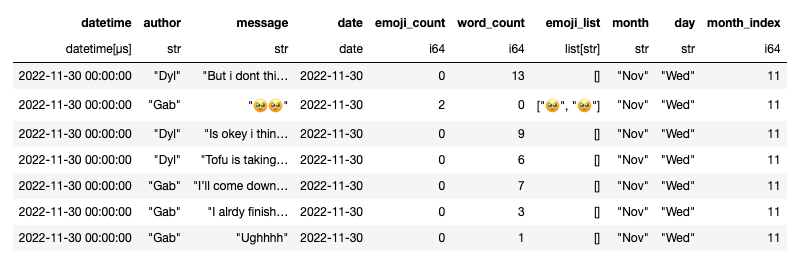
prepped.tail(5)
We now have our prepared dataset and we're ready to begin our rigourous and highly professional data analysis, for which I'll be using the seaborn data visualization package.
Data Analysis
Despite the title image I am definitely not a Data Scientist and infact have no idea what I'm doing here :)
Before getting into the trends over time, I wanted to first start with some visualizations of the total number of messages and emojis sent in 12 months
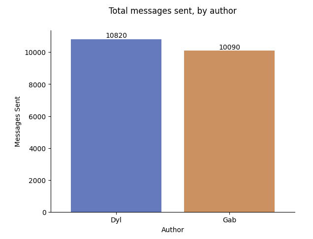

Despite sending a similar amount of messages, my total number of emojis sent (671) is less than half the number sent by Gab (1516). In fact, Gab sent ~70% of all the emojis in our chat history. So, it's already not looking good for me.
As a quick reminder, the original claim that I wanted to prove/disprove with this analysis was the following: "Do I send less emojis now than I did before?". To answer this, we're going to look at our data on a month-by-month basis, running from December to November (the first 12 complete months I had data for)
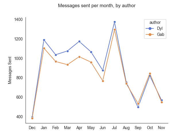
If we look at the numbers for monthly sent messages above, we can see a very wide range: as little as ~400 in December peaking at ~1400 in July. I think the low total in month one is probably a result of us still getting to know each other and playing it relatively cool at this point. The wide variance for other months might correlate with how much time we spent physically together in those months, and the trend downwards in later months could be explained by our adoption of a long nightly phone call - meaning we would text less throughout the day
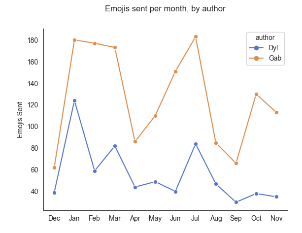
Coming to emojis sent per month, we can see that I sent less emojis than Gab in every single month. I can already tell from this that month one and two do seem to have been some of my bigger months for emoji usage (relative to Gab's). Now let's graph a trend line
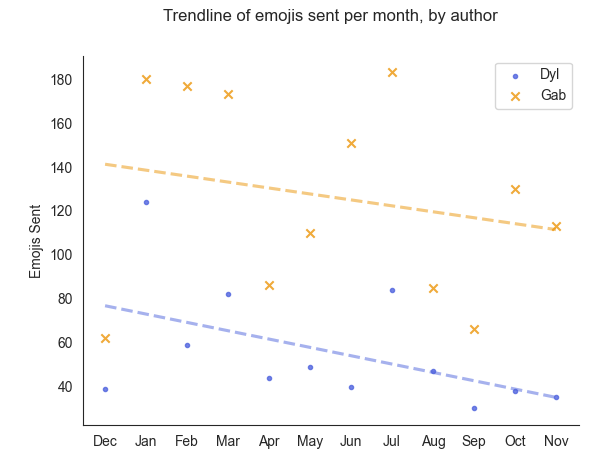
The above chart shows a trendline of emojis sent (over time). At first glance the slope of both lines seems pretty similiar, and I was actually happy with this (as it would imply we're both using less emojis, at a relatively similar decreased rate). This seemed a bit off to me: if you look at the start and end points of each trendline, you can see that the blue trendline (mine) drops from ~80 to ~40 (a ~50% decrease) whereas the yellow trendline (Gab's) drops from ~140 to ~110 (a ~23% decrease).
So what does this mean? Don't ask me! I told you I have no idea what I'm doing. If I had to guess though, I would say that the high variance of message counts from one month to the next is making it difficult to detect and pull out trends from the above charts. For example, it's hard to see how much emoji count decreases are a result of us sending less emojis or how much of the decrease is coming from us sending less messages overall. I now decided that I probably need to calculate and graph an emoji-per-message rate over time
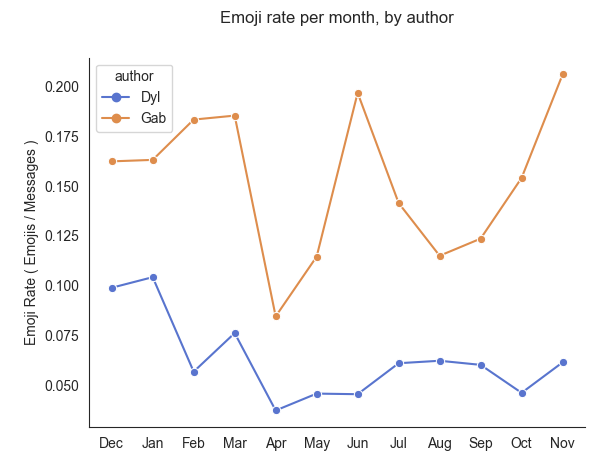
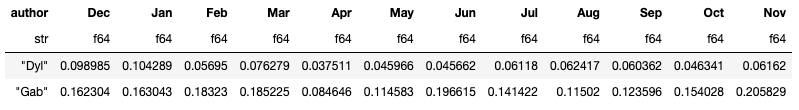
The above chart graphs an "emoji rate" for each of us over time. Here we're defining the emoji rate as the number of emojis sent per message. For example, if we look at the month of December my emoji rate was ~0.1 which means that I sent approximately 0.1 emojis per message, or in other words I sent (on average) one emoji for every 10 messages.
This emoji rate graph gives us a better view of the relative emoji frequencies and how they changed over time, independent of how many messages happened to be sent in each month. We can observe that my (blue) emoji rate was highest in month one and two and has indeed decreased over time. Gab's (yellow) emoji rate fluctuates more widely month to month, but has a much higher baseline and is actually trending upwards in the later months. Speaking of trends, I wanted to see how the trendlines would look on this emoji rate data
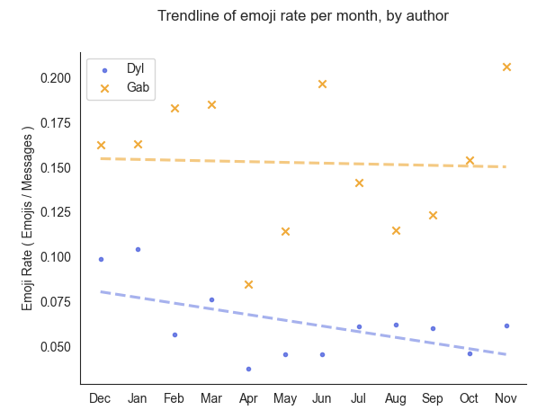
Right away I can say that the slopes of these two trendlines appear more distinct from each other (compared to the previous trendline graph above). The trendline of Gab's emoji rate (yellow) is relatively level, but the trendline for my emoji rate (blue) is clearly declining over time.
At this point, I'm happy to concede defeat and say that I have indeed become lazier with my emojis over time. Hopefully this blog post will be a small consolation Gab :)
Future Work
In the spirit of done is better than perfect, I'm posting this now with some future items left todo:
-
Complete the analysis of the actual emojis used and trends (see second half of the notebook).
-
Re-do some analysis in which emoticons like ":)" are counted as emojis (as I use them a lot).
-
Regenerate the graphs after redefining the "emoji rate" as the number of emojis per 10 messages. This would make the emoji rate graphs more interpretable (as decimal numbers can be trickier to compare to each other).